Trăng Vàng Black & Gold is the latest in high-end mooncake production presented by Kinh Đô with the packaging design created by Holmes&Marchant Singapore x Tree Studios for the Mid-Autumn Festival in 2020. This collection comes with laser-cut lanterns and elegant gift boxes, and the ‘Kinh Đô’ logo is the highlight of the packaging. In the hope of reaching a wide range of customers while keeping traditional values, the products made from four materials with elements inspired by Vietnamese tales and symbolism.
–
Concept
Trung Thu (‘mid-autumn’) is a festival celebrated in East and Southeast Asia. It is the time to express one’s appreciation for a successful harvest season by giving offerings to their ancestors, gathering at home and watching the moon together. In modern times, it is still an occasion for reunions and sharing a dessert symbolising harmony and unity. That dessert? Mooncakes!
Mid-Autumn is also called the ‘Children’s Festival’ in Vietnam. This is owing to the belief that the pure souls of children and the sacred worlds have a special bond. Children used to go out playing under the full moon while holding lanterns. This holiday emphasises the harmony of human and nature as an old saying goes, “people and the moon reunite to form a full circle”. The emblems of the moon, dragon, lotus and carp have repeatedly appeared in Vietnamese arts and folklores. Thus, these elements from our rich and fascinating culture are the inspiration for this project.
–
Color Pallete
Gold
Gold with its glistening feature and brilliant hue - catches our eyes at the very first glance and draws our attention to itself. Its association with luxury, prestige and royalty alongside purple. For the effect of illumination and its warmth embracing everything it links to that gold becomes a preferred choice of colour to go with the moon.
Black
Black absorbs all light and creates an air of mystery that reminds us of the universe. Though we might find many negative associations with black, we also see it intriguing: We find black everywhere in life. Its meaning varies depending on which colour it goes with. As an immutable benchmark, black has been used to express luxury and elegance.
–
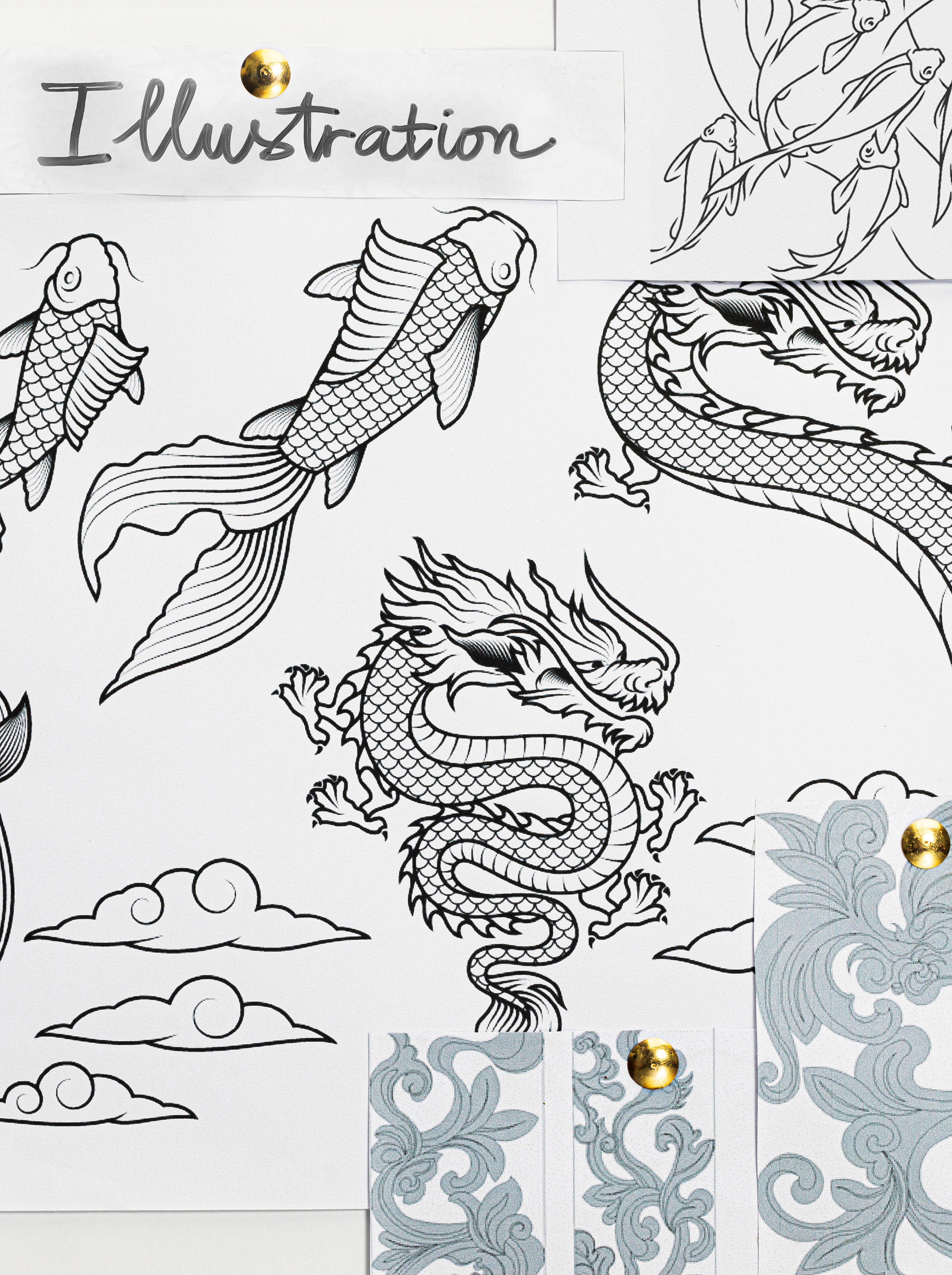
Illustration
Lotus
The pink lotus is the national flower of Vietnam due to its popularity and its distinctive features. Not only is it a symbol of love and compassion but also of the noble mind and pure spirit.
Full moon & Clouds
The moon during the Mid-Autumn Festival always reaches its peak of fullness and gleams brightly during the night. People traditionally view it as a symbol of fulfilment and happiness. The full moon is commonly depicted alongside a sky full of clouds that represent ‘fortune’. Clouds bring rain that waters the crops, which is crucial for Southeast Asian farmers.
Dragon
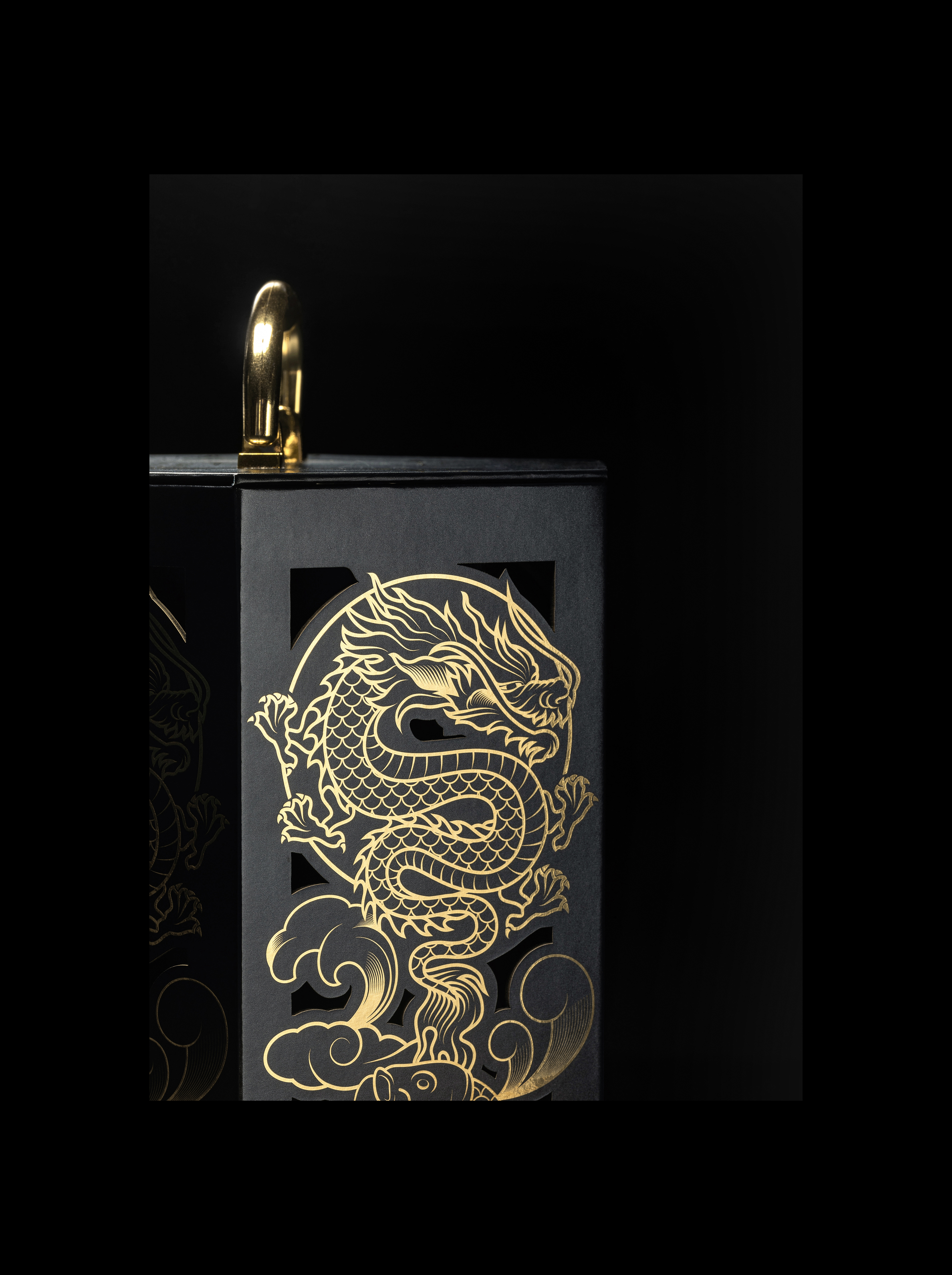
Vietnamese consider their dragon as a symbol of nobility, wisdom and strength. According to mythology, the form of the dragon is unique: the head of a camel, horns of a deer, eyes of a hare, ears of a buffalo, body and neck of a snake, scales of a carp, claws of an eagle, and feet of a tiger. It also has a long barb on each side of the mouth. The Vietnamese dragon was also particularly favoured as a symbol of royal authority.
Carp
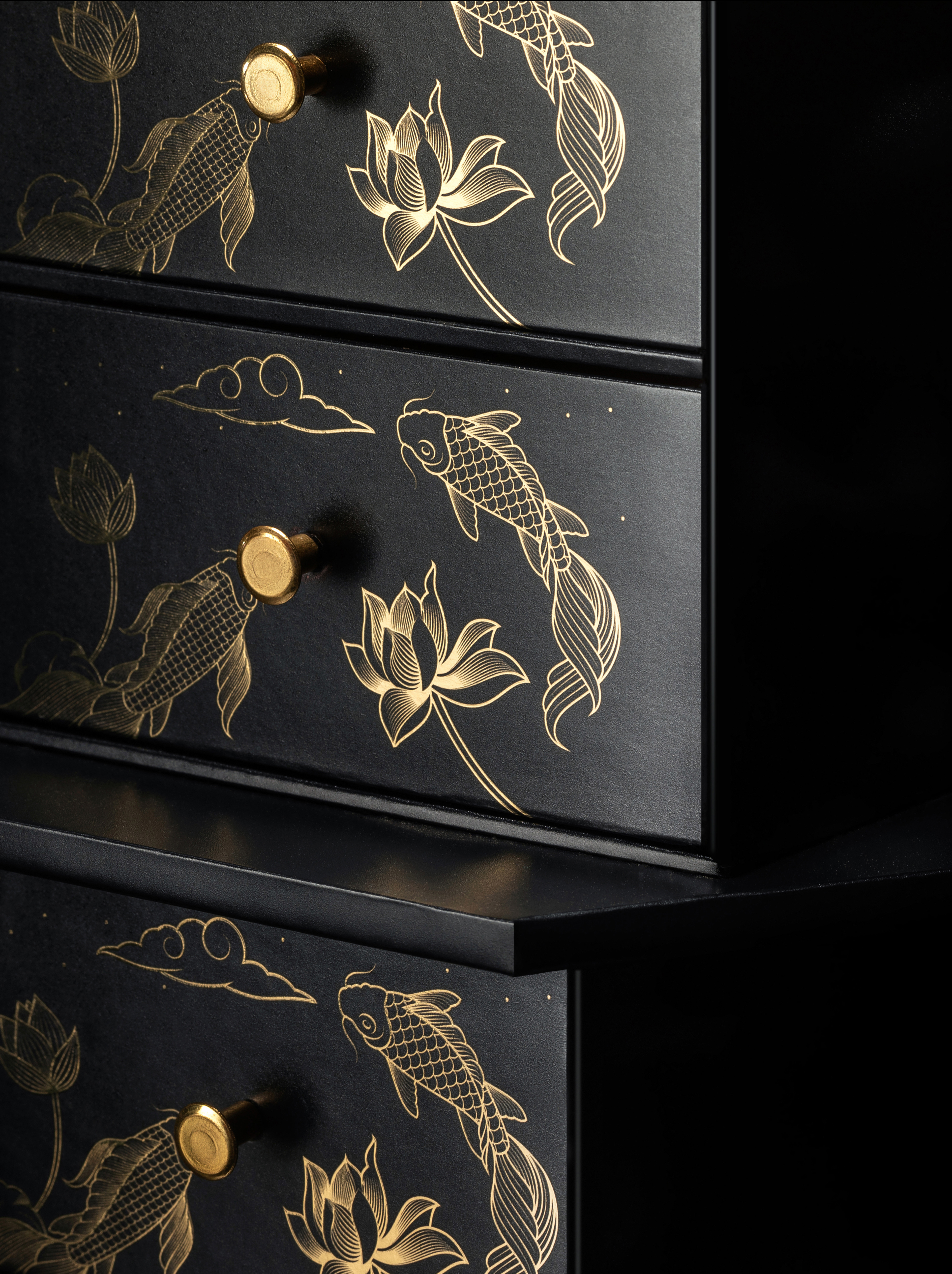
Carp fish is a renowned symbol in Vietnamese culture and usually paired with the pink lotus in visual arts. It represents transformation, hope and luck. For Vietnamese, they believe that carp is ridden by the Kitchen’s God back to heaven before every Lunar New Year. The image from the ‘Carp leaping over Dragon’s Gate’ folktale inspired the visual design for these gift boxes.
Thus, each symbol and colour are combined to represent a high-end gift that wishes for courage, accomplishment, health and good fortune to those who receive it.

–
Product Development
Even after submitting the final design, this is not the final task for TREE Studios. The number of products that need to be completed is the same, while the difficulty multiplied with different packaging lines. A continuous assessment needs to be done, including testing samples, making comparisons, doing inspections and checking final products. Therefore, we could meet the release date and provide a high-end product.

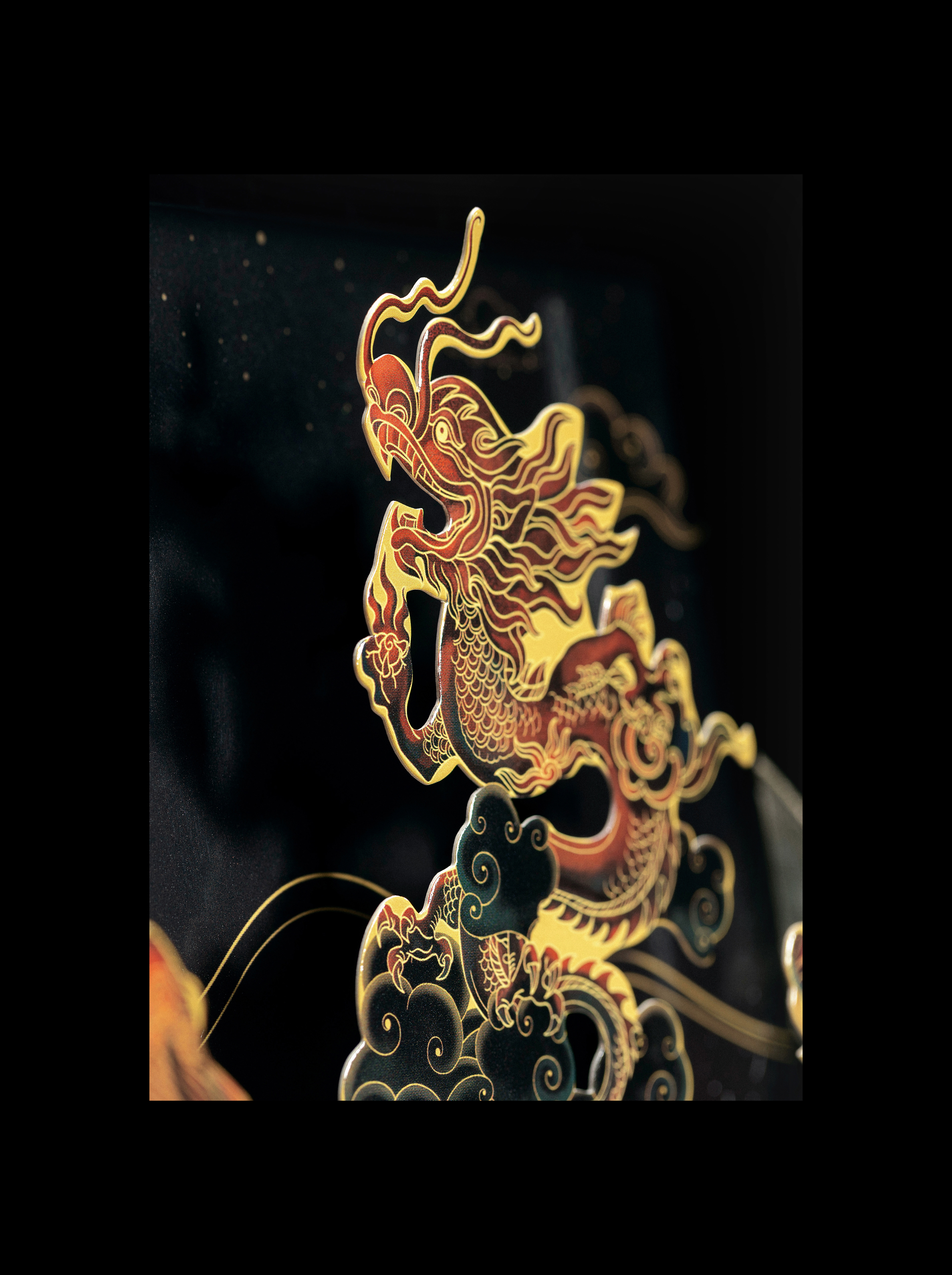
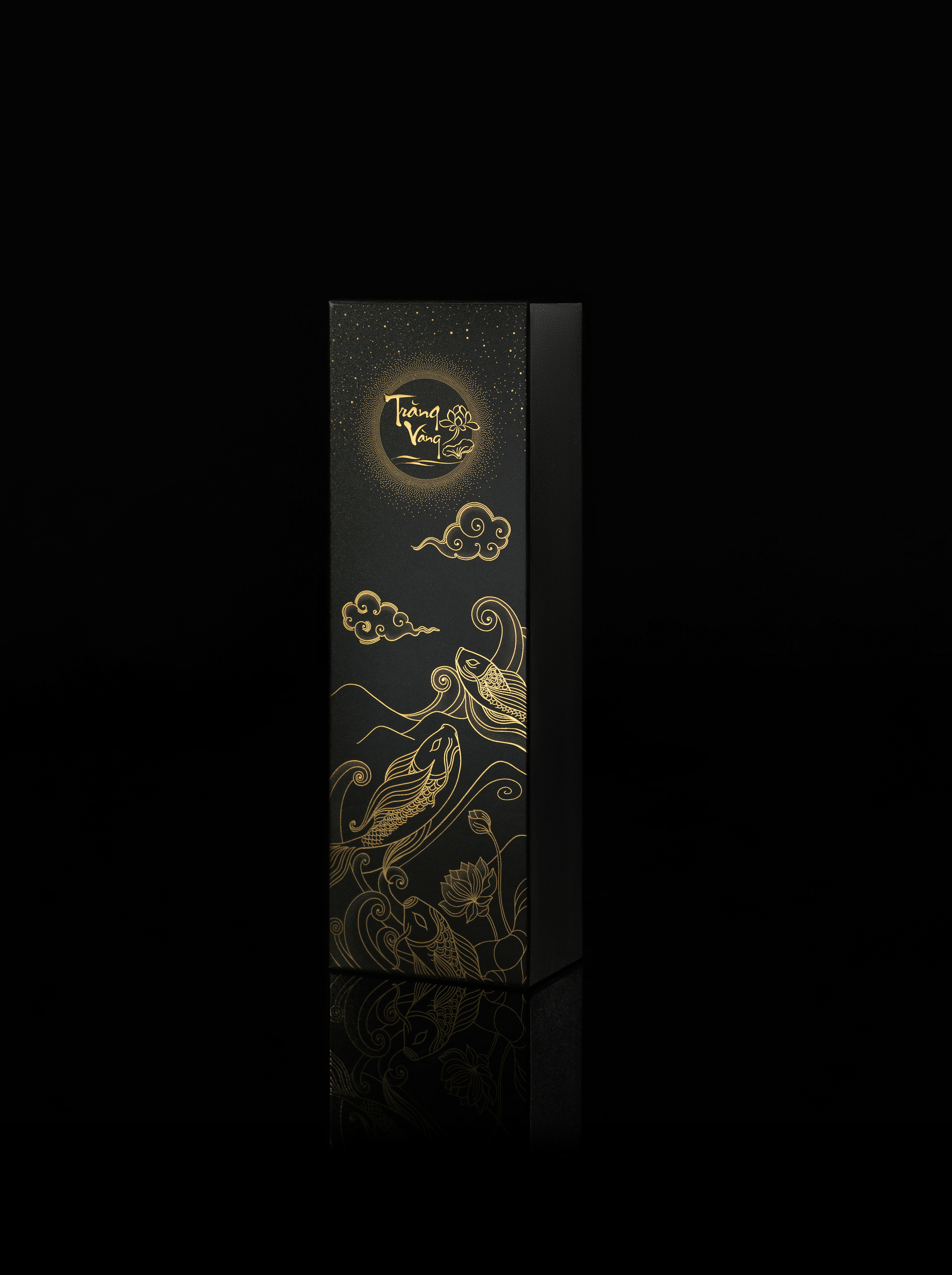
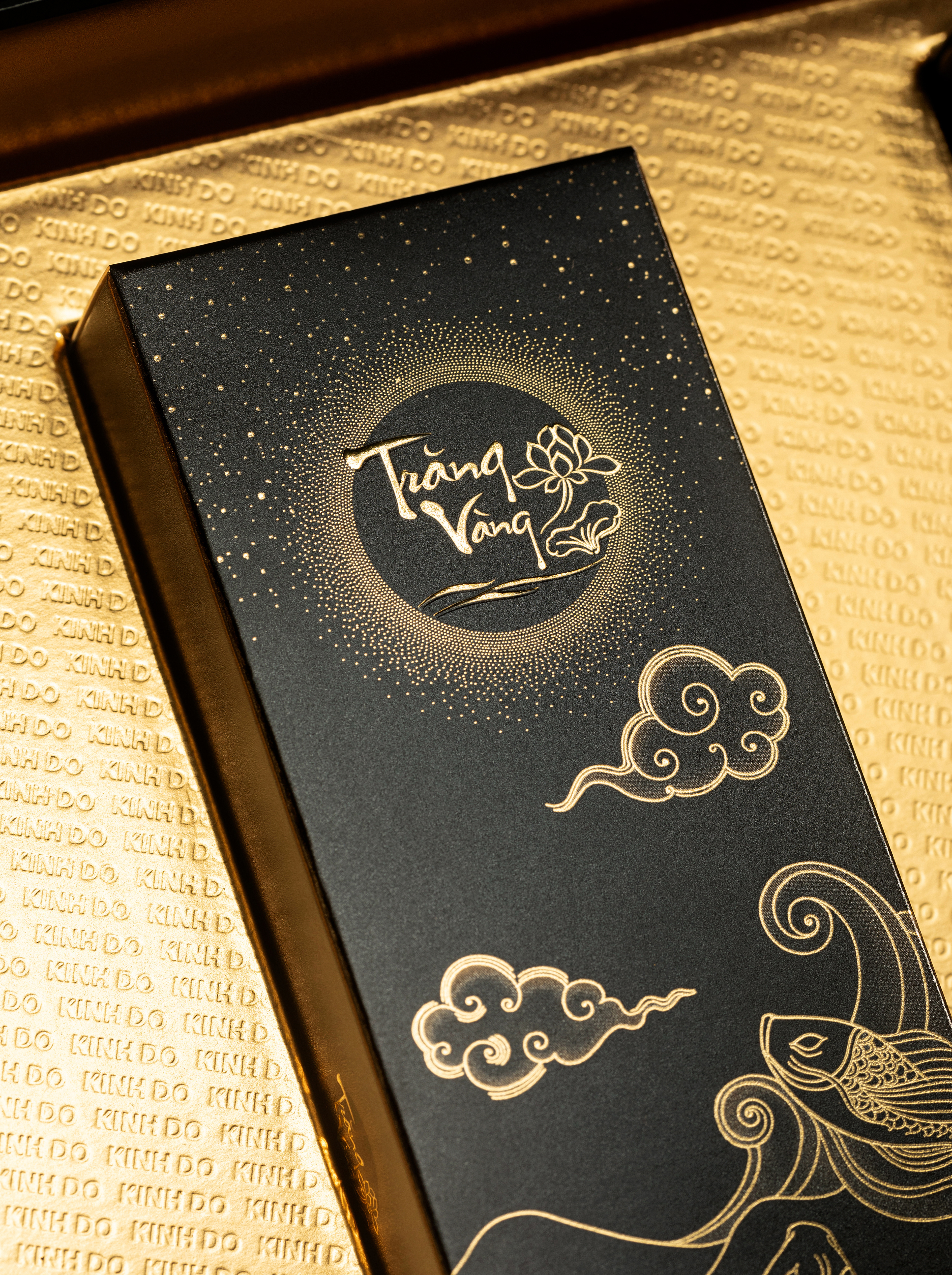
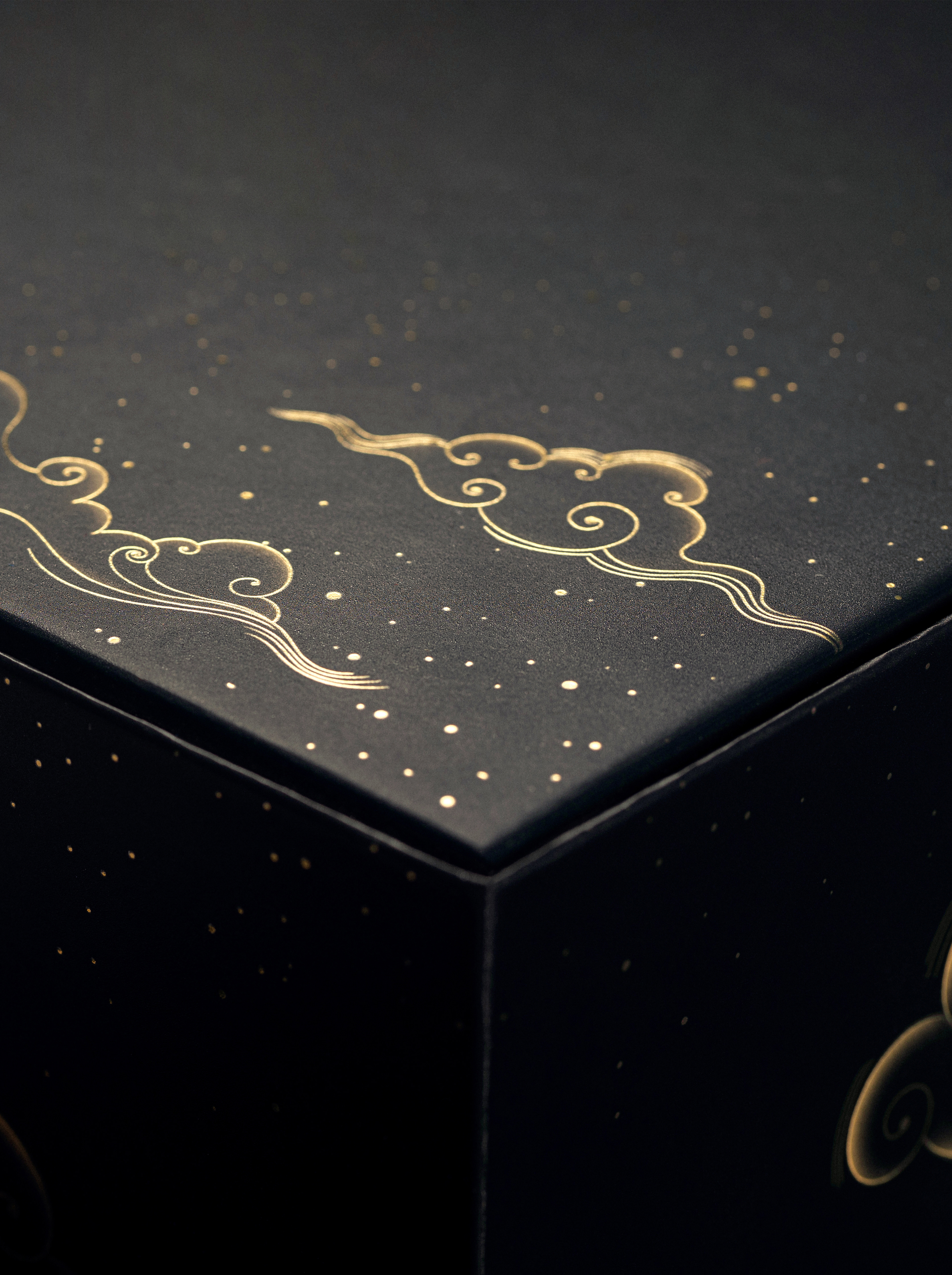
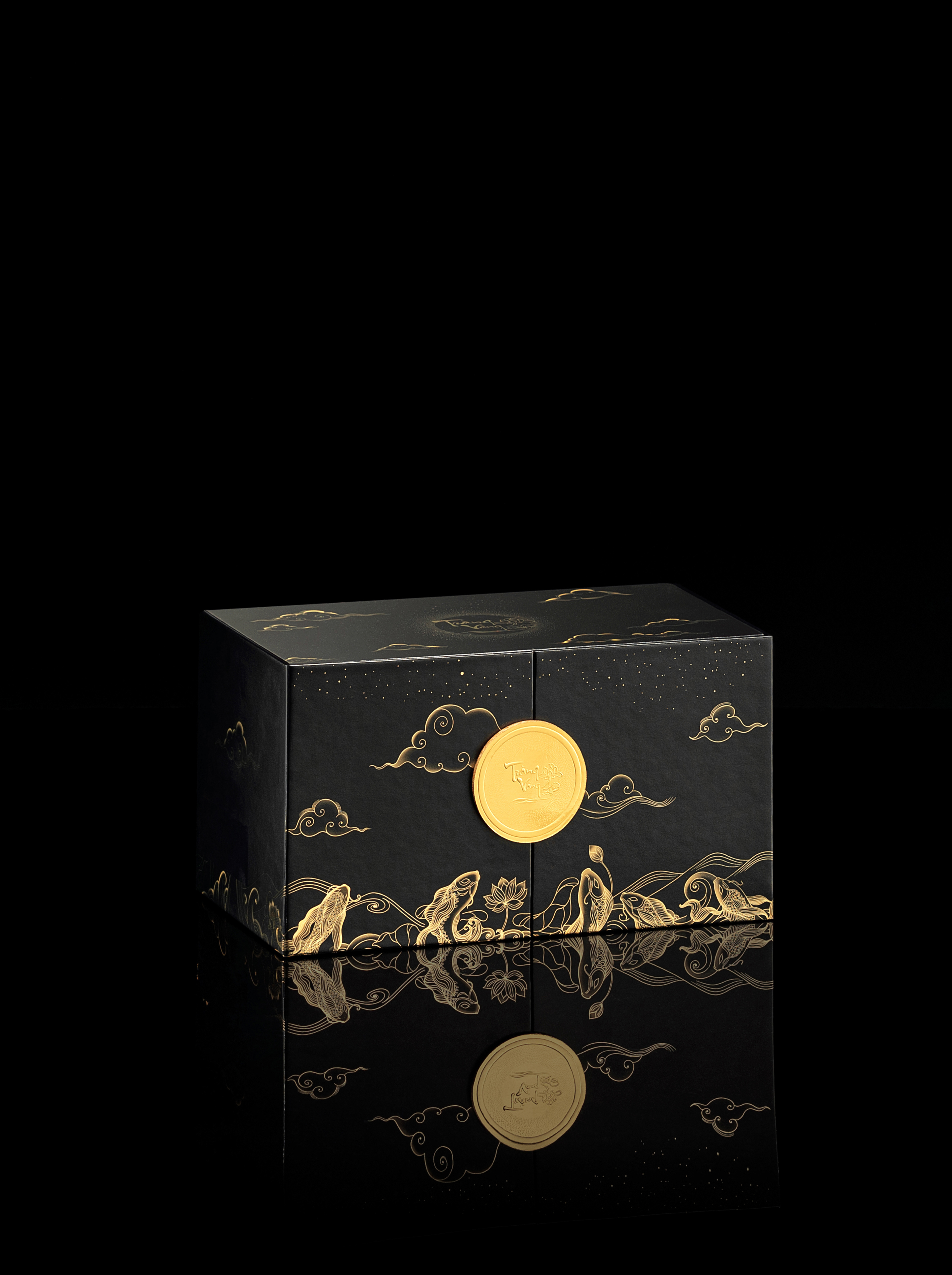
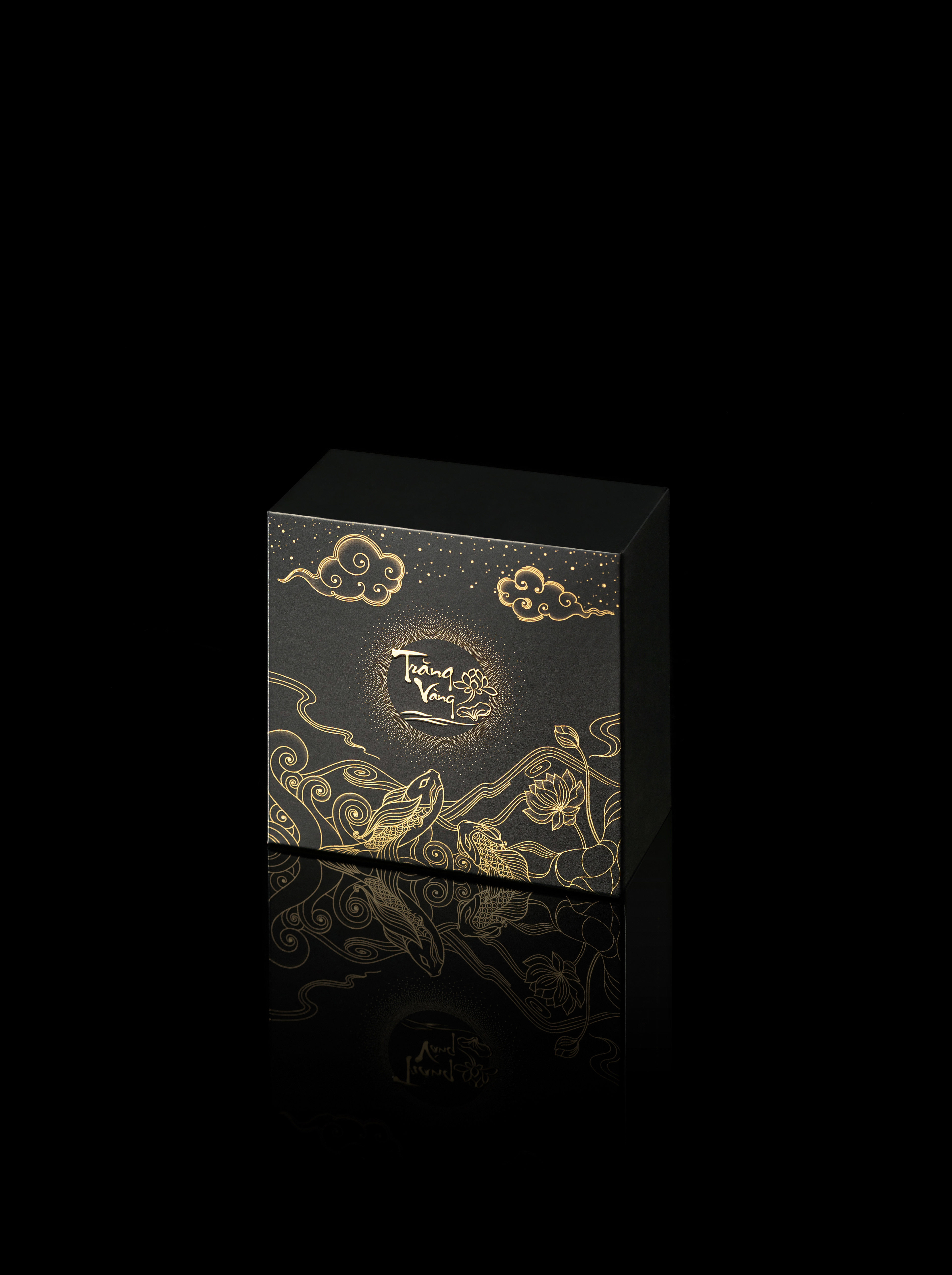
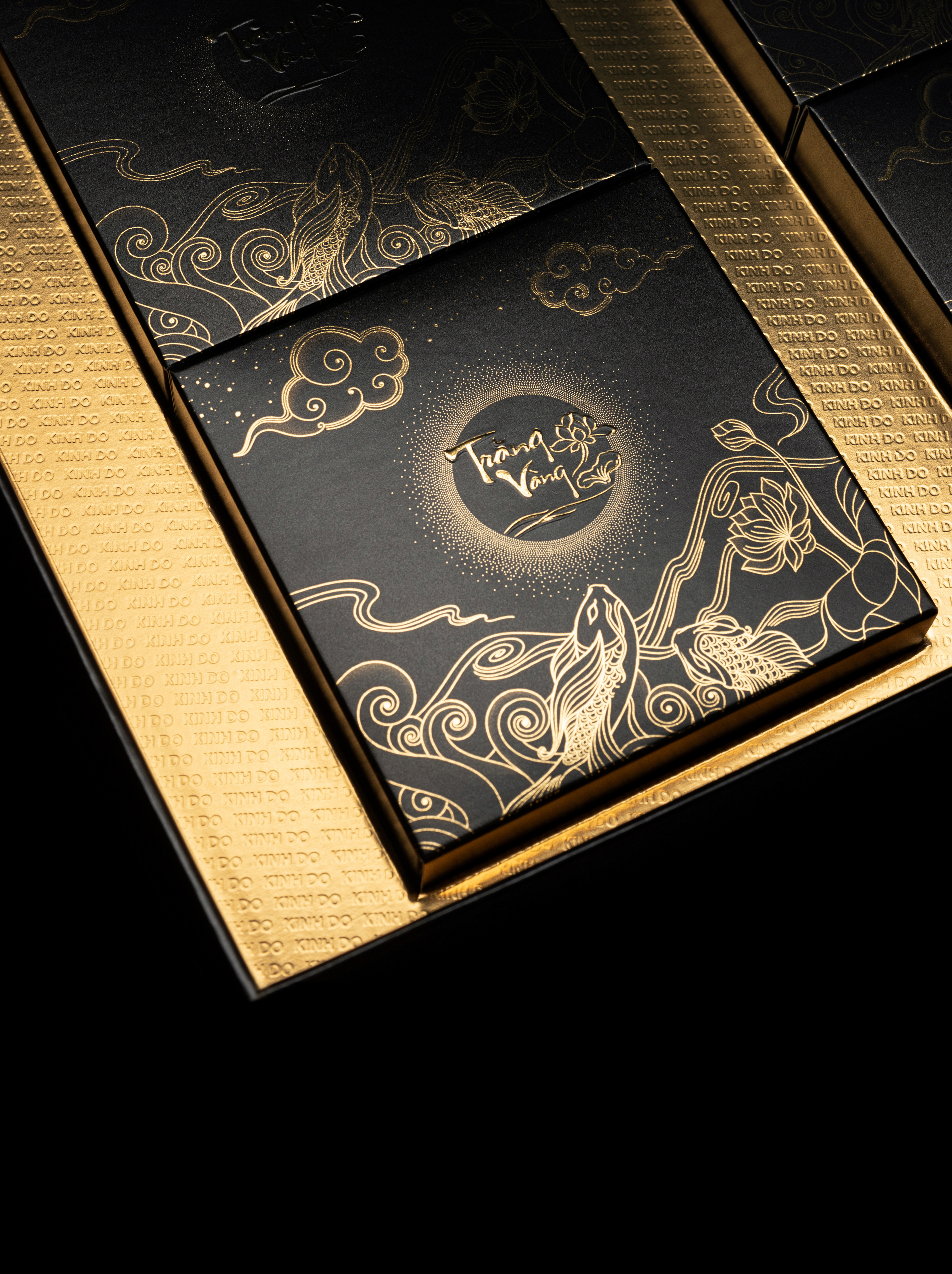
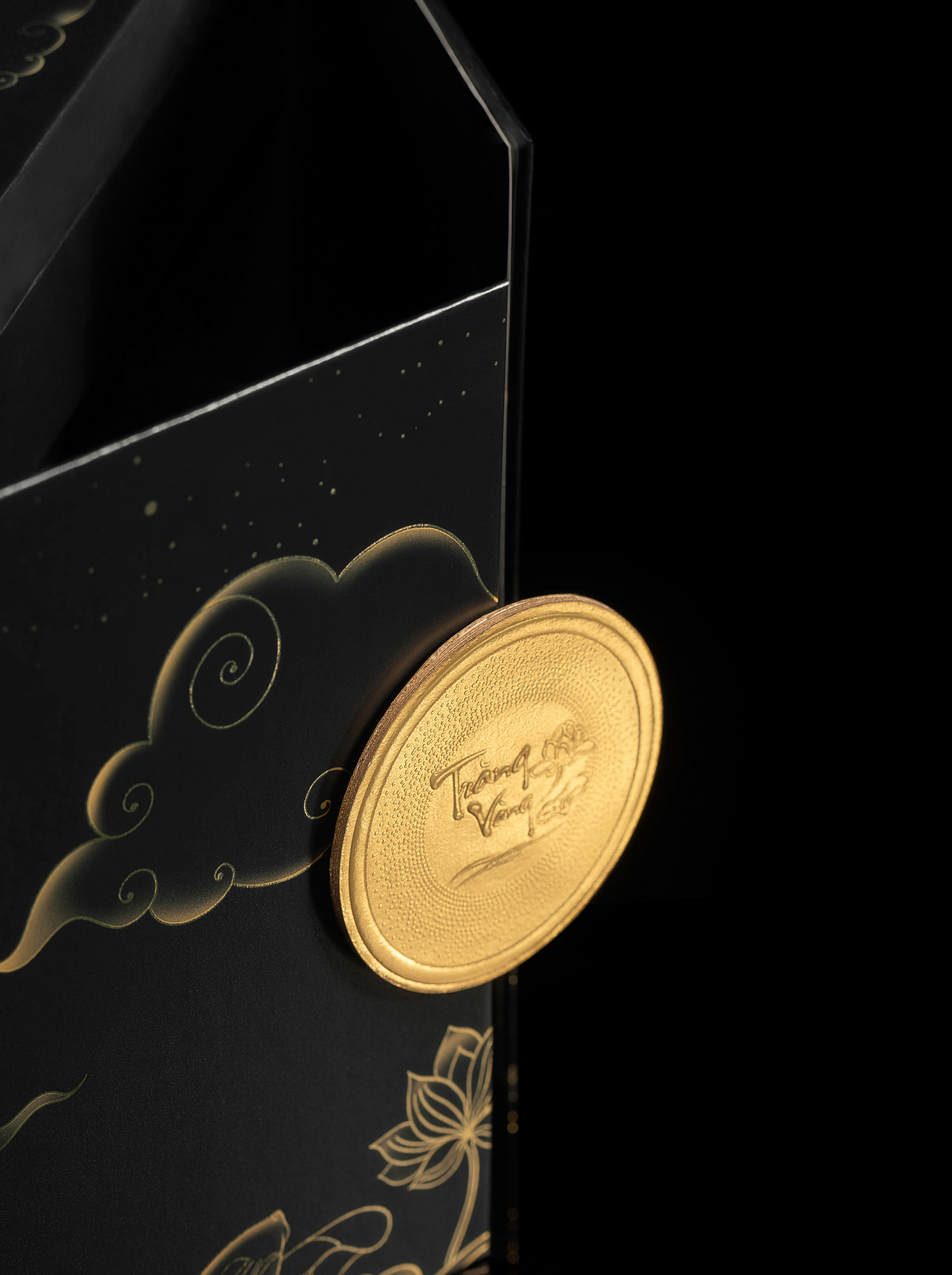
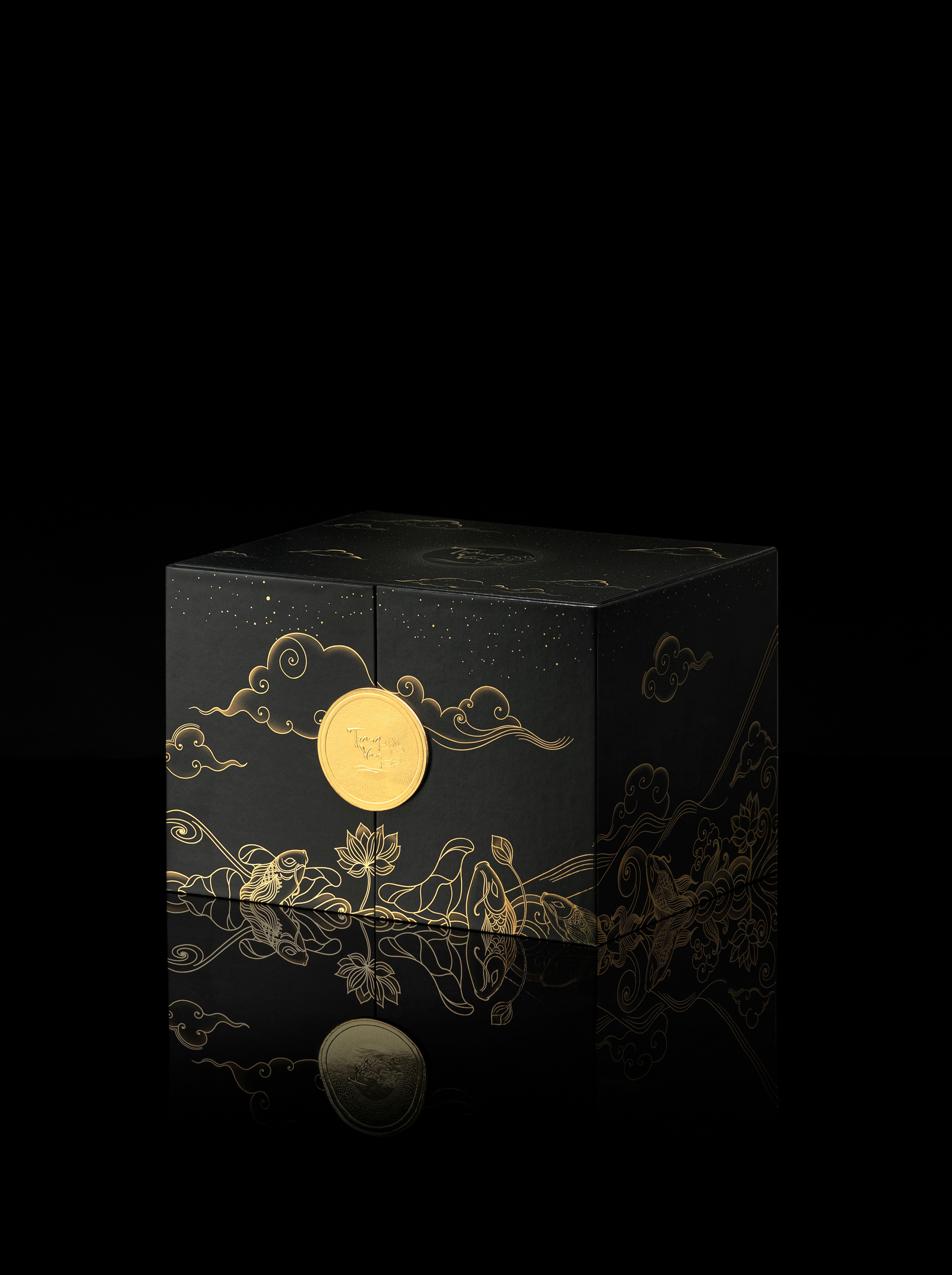
One of the most challenging aspects is printing the illustrations on different packaging materials, such as carton paper, art paper, cardboard, hard plastic and lacquer embellished with nacre by cutting and grinding mother-of-pearl. It is essential to keep colour consistent across print and digital for each print material. For example, black has never been an easy colour to print. It should neither be too light like concrete nor too dark like ebony. So the design team had to make adjustments and made sure the shades and hues are consistent across all the products.



–
Mooncake
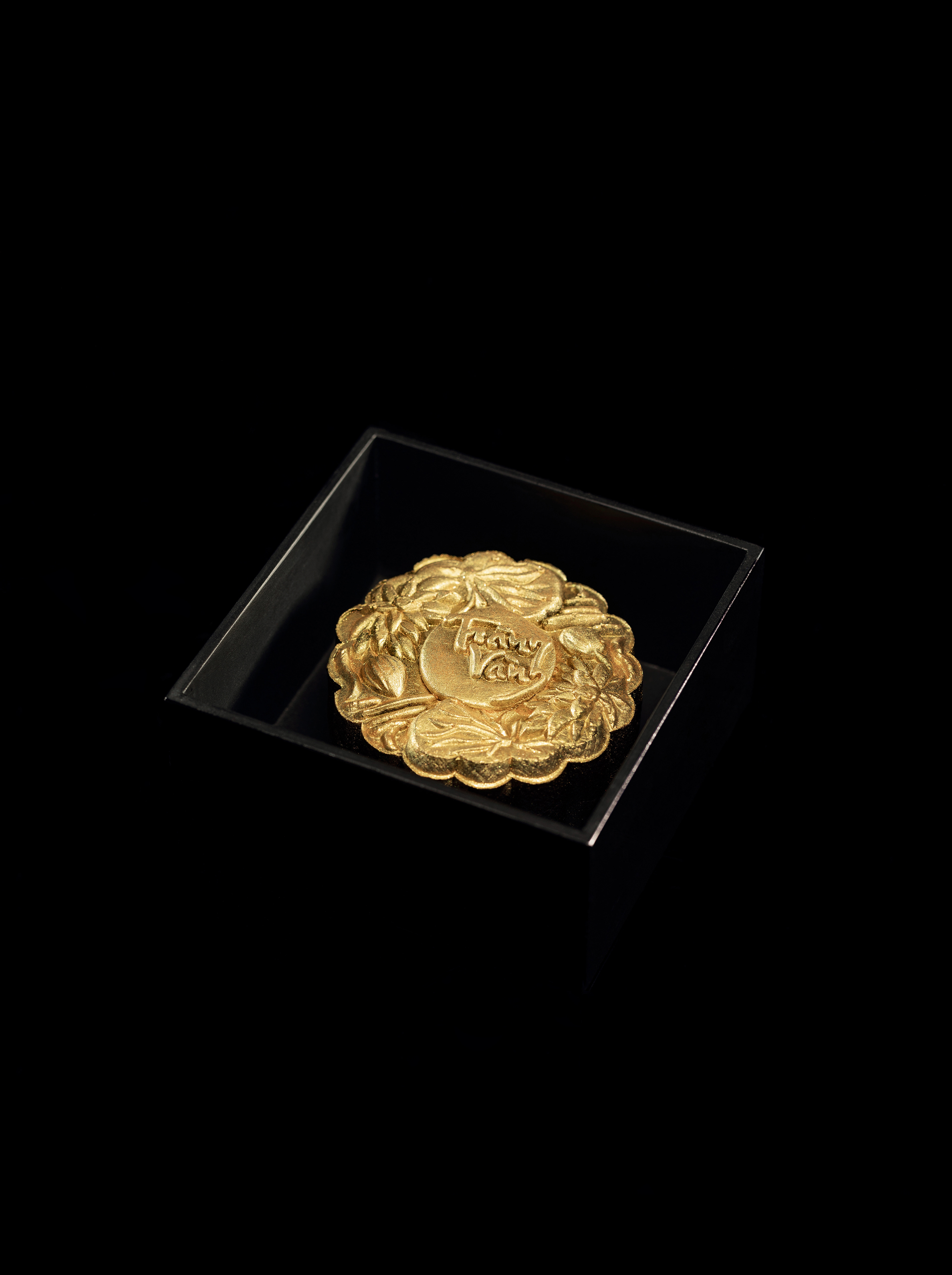
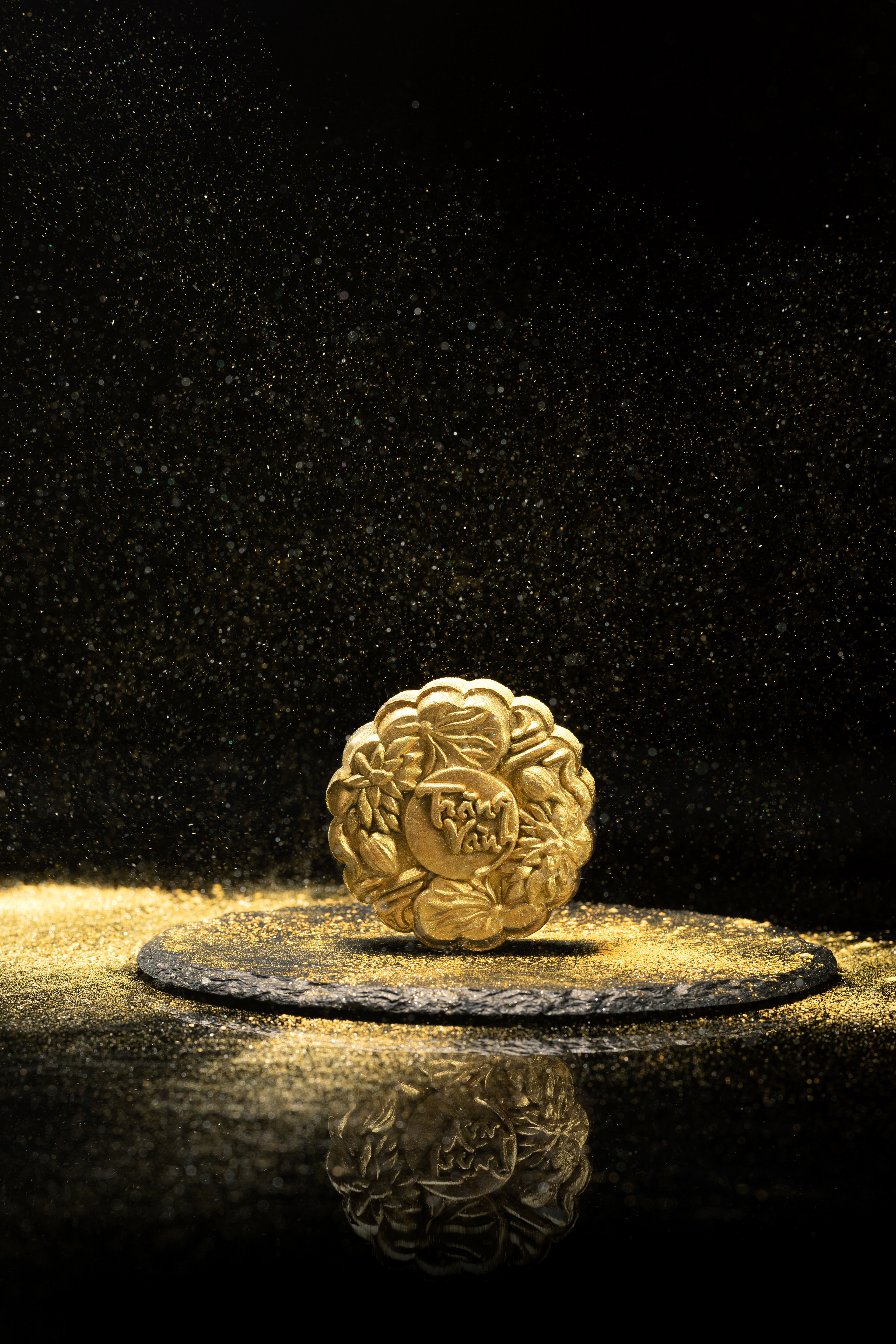
The iconic premium ‘Trăng Vàng’ mooncakes are not only encased in a lavish black crust but also sprinkled with a layer of edible gold powder and filled with luxurious ingredients. To represent the finest craftsmanship of Kinh Đô mooncakes, the art by TREE Studios waưs used to make the cake moulds. The vector illustrations also had to be edited to be suitable for the finished product. In term of the unique laser-cut lantern boxes, the accuracy of the cutting grooves is critical. Since it affects the brightness of each lantern, the dimensions of the intricating grooves should be as accurate as possible to the designer’s specifications.


_
Thanks for watching this project
–
Credits
Project: Trăng Vàng – Packaging Design
Client: Mondelez Kinh Đô
Studio: Holmes&Marchant Singapore x TREE Studios
Creative Director: Gökçe Şahbaz
Business Director: Saurabh Singh
Account Manager: Atima Sarda
Lead Design: Chu Dinh
Lead Illustration: Nguyễn Kei
Artist: Nguyễn Huy Phương, Lê Trần Mỹ Duyên
Structure Design: Stanley Chew, Fang Hui Teh
Support: Hà Như, Minh Hoàng
Portfolio/ Showcase: Đức Ngô
Photographer: Kitsu
Gaffer: Tin Lee
Copy Writer: Lệ Lin
Motion Graphic: Thanh Tú, Dương Hoàng
Retouch: Nguyễn Quý
Motion Graphic: Thanh Tú, Dương Hoàng
Retouch: Nguyễn Quý
Coordinator: Thảo Huỳnh
Contact for work with us
info@tree.net.vn
Follow us
