Project
CAT TUONG GROUP
Calendar
Art Director: Pulu
Illustrator: Hoang Tan, Tu Ngo
Project Manager: Tan Le
-
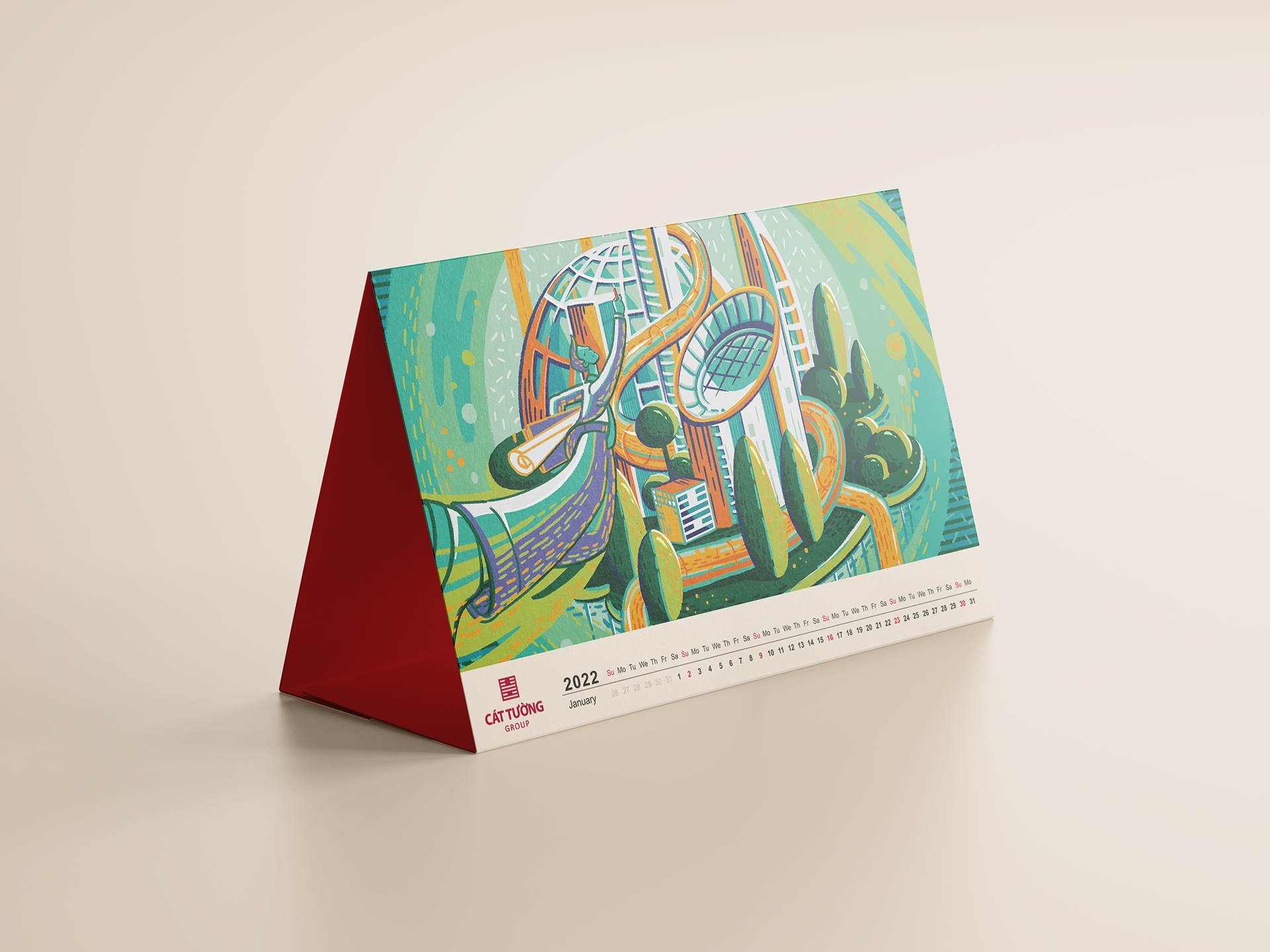
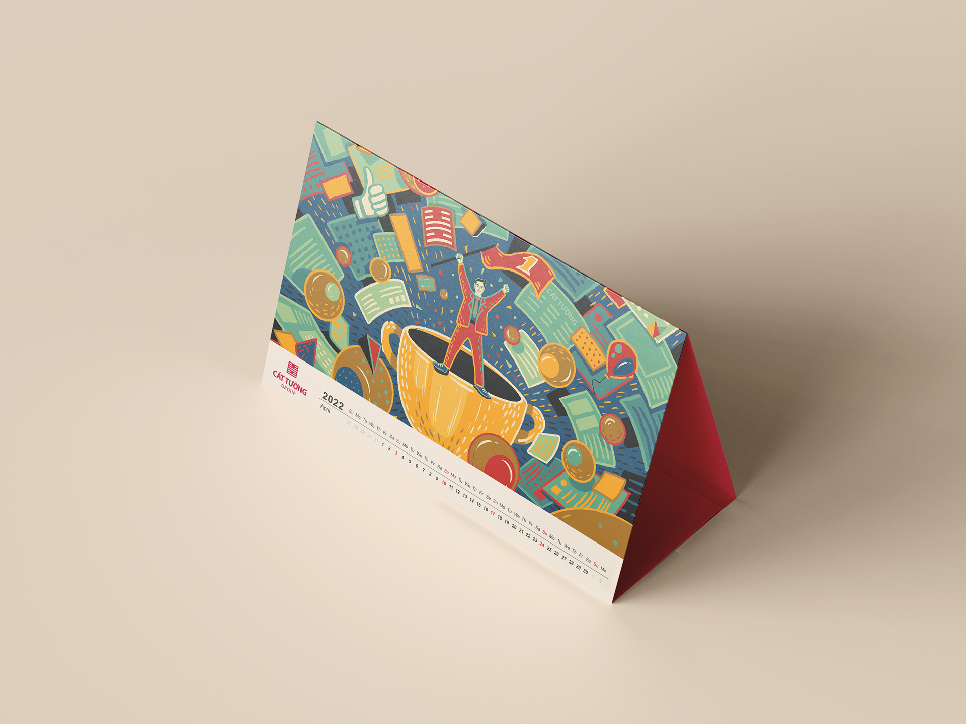
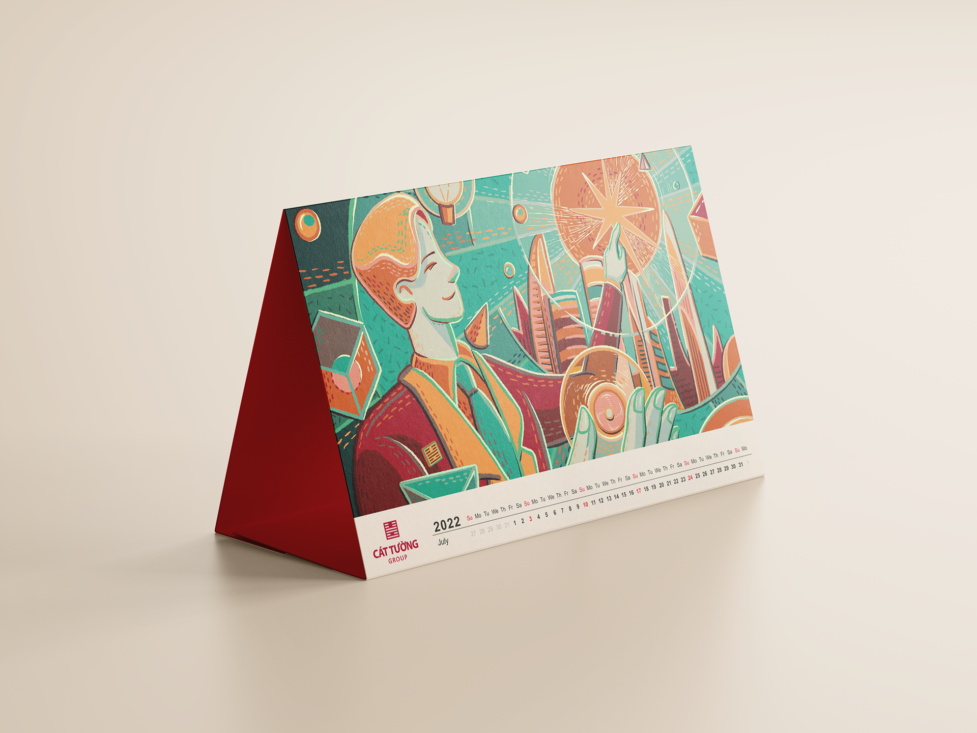
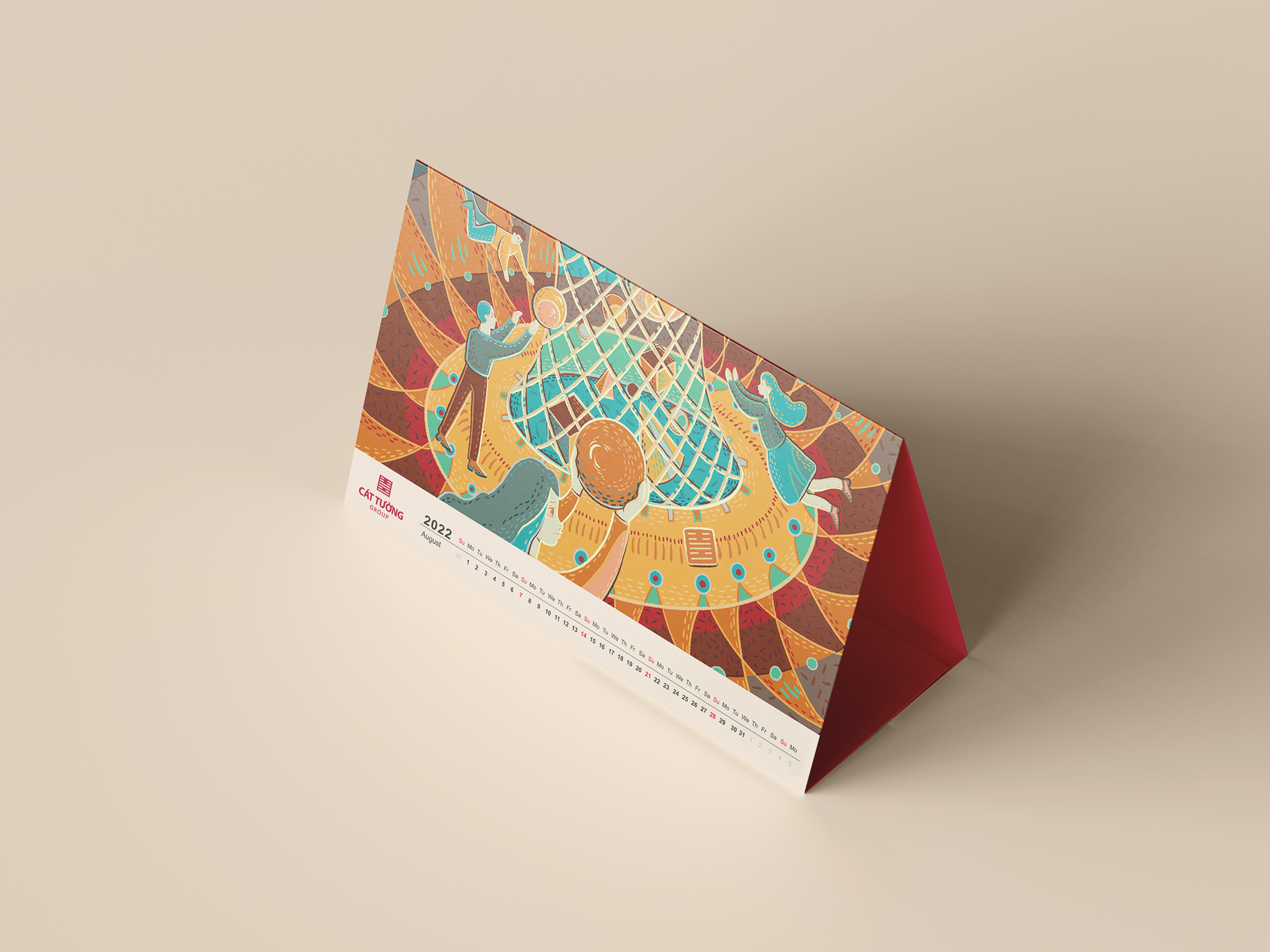
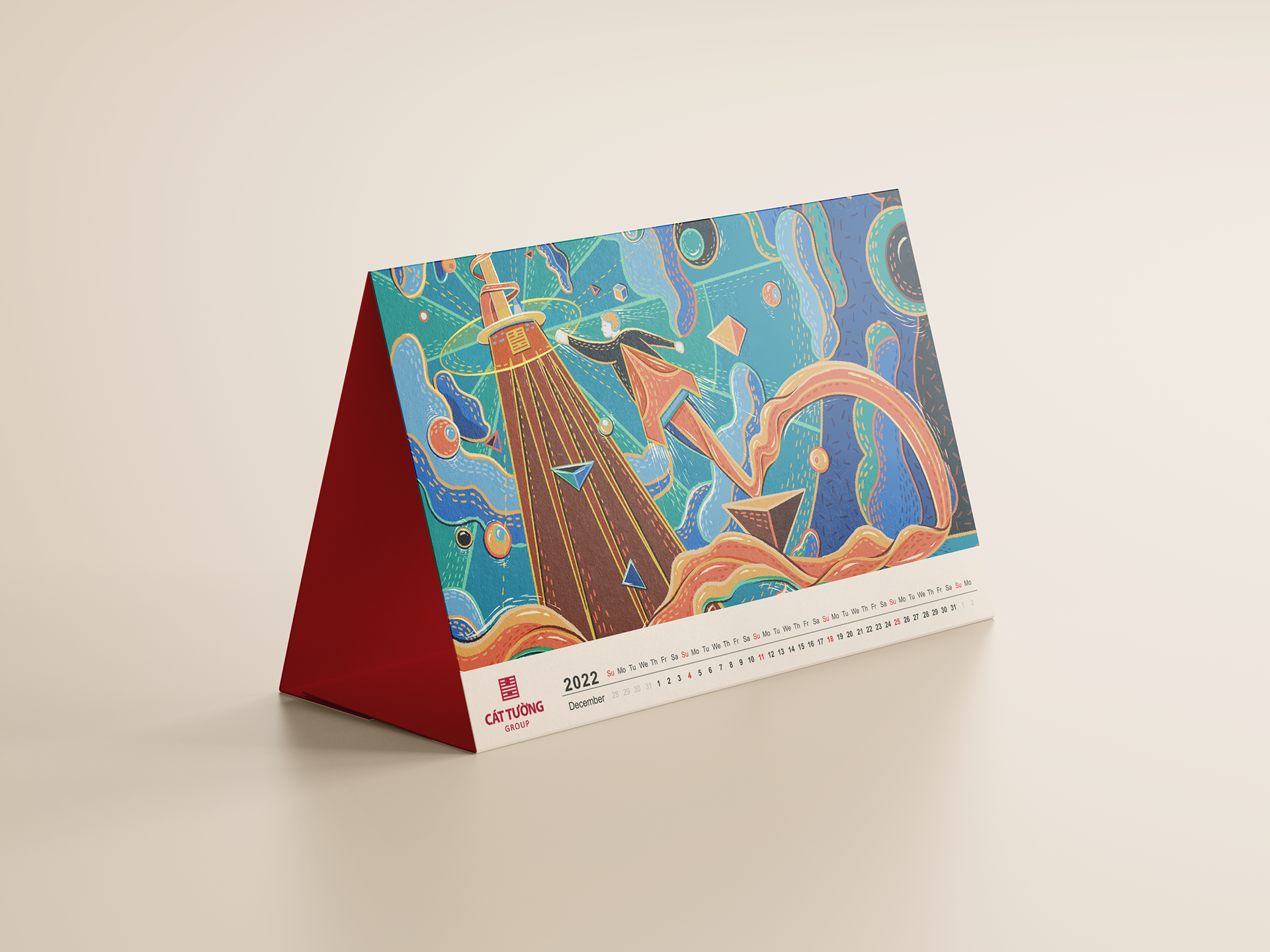
These artworks show Cat Tuong Group's core values. The art style is the expressive, the future and improvement which is like the development and innovation that the Cat Tuong Group is focusing on.
*Note
All images below are not official products.
They are only demo to display the artwork.
Official products are produced and circulated internally by Cat Tuong Group
We used fantasy elements in all the paintings to affirm the great potential of Cat Tuong Group and its vision for the future. We implemented the project to welcome the new year and announce Cat Tuong Group's innovative business strategy.
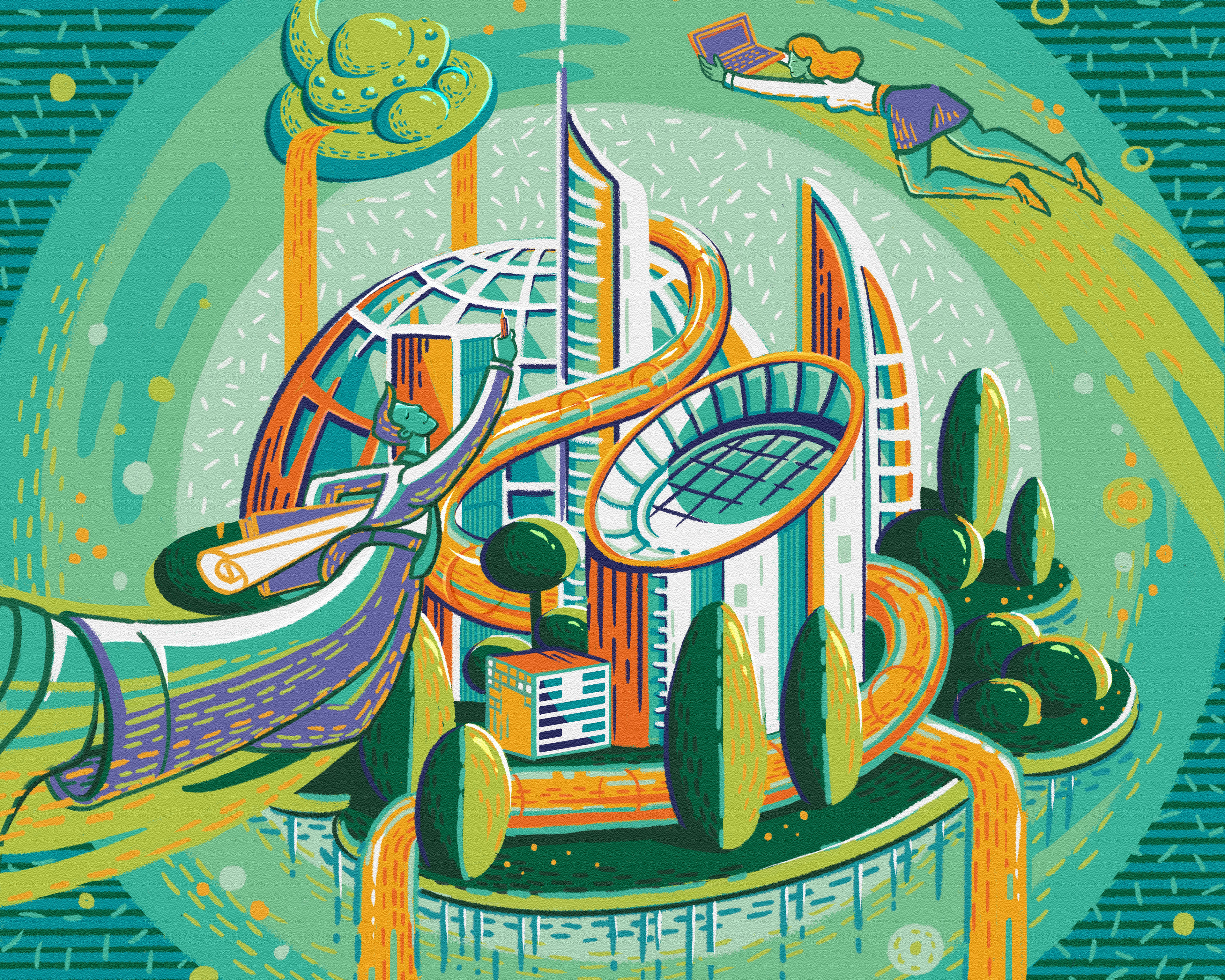

Spring is a season of fertility, a season of young shoots, hopeful beginnings. We chose green tones to give a feeling of freshness, purity, and focus on the environment.



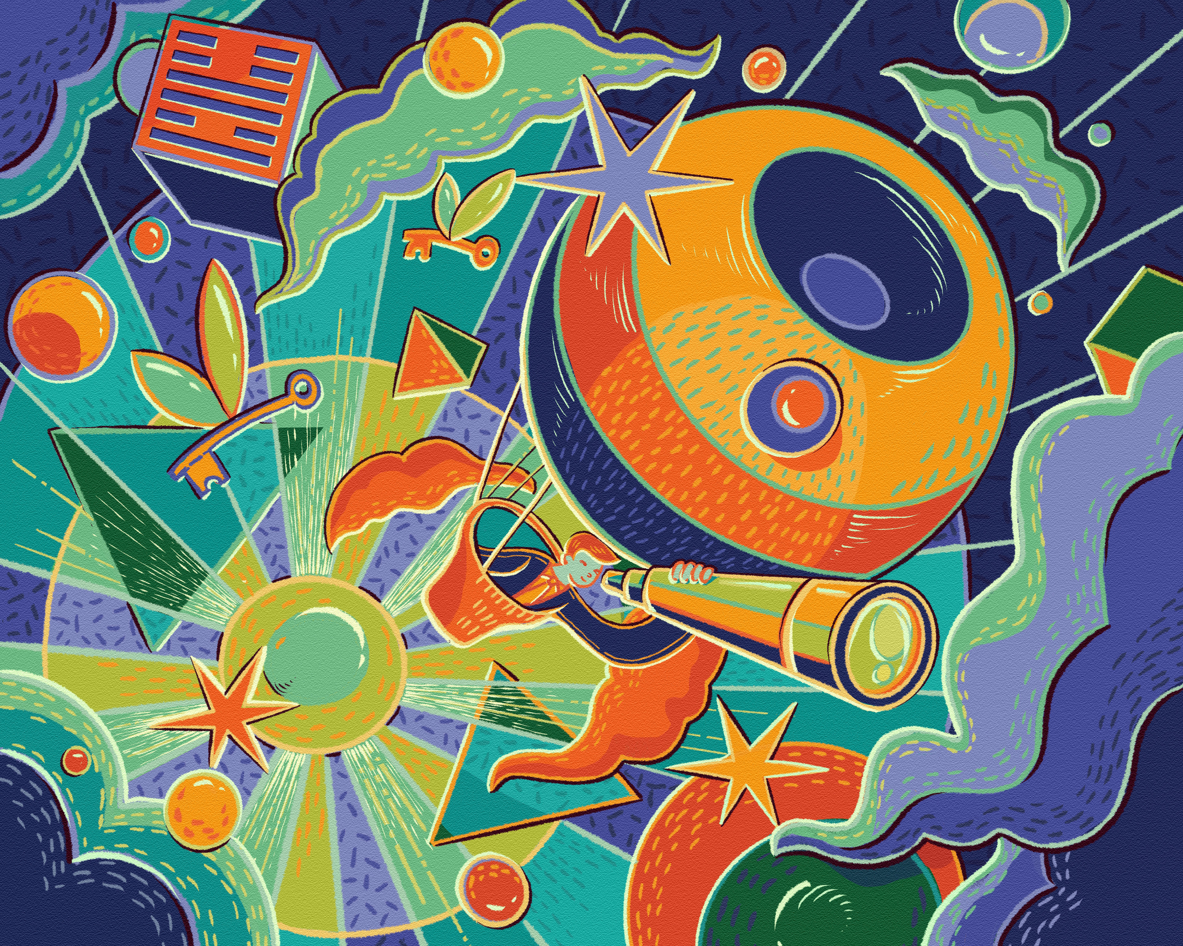
Summer is extremely warm, the season of enthusiasm and dynamism. So yellow tone is the most suitable color. Besides, yellow is also the color of wealth and achievement.



Autumn is a quiet season. We want to slow down the enthusiasm from the beginning of the year to plan for explosive events at the end of year. The duo of sepia and turquoise will be the first choice to bring safety to Cat Tuong Group's strategy.


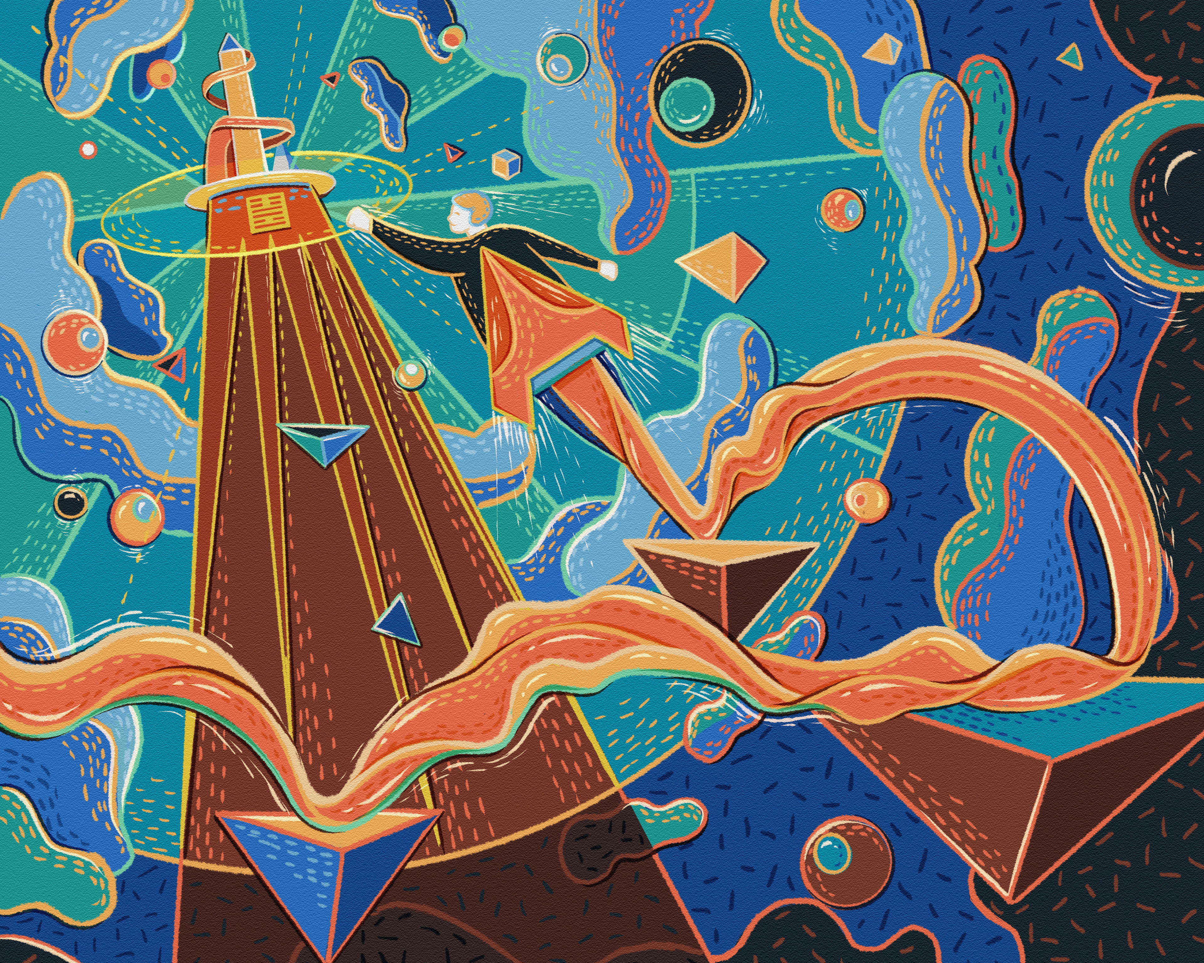
And finally, the peak is a place for just one person. Freezing and also extremely great. Winter, with a mysterious blue color, represents success, conquest, peak glory, and shine.
